
art sale poster
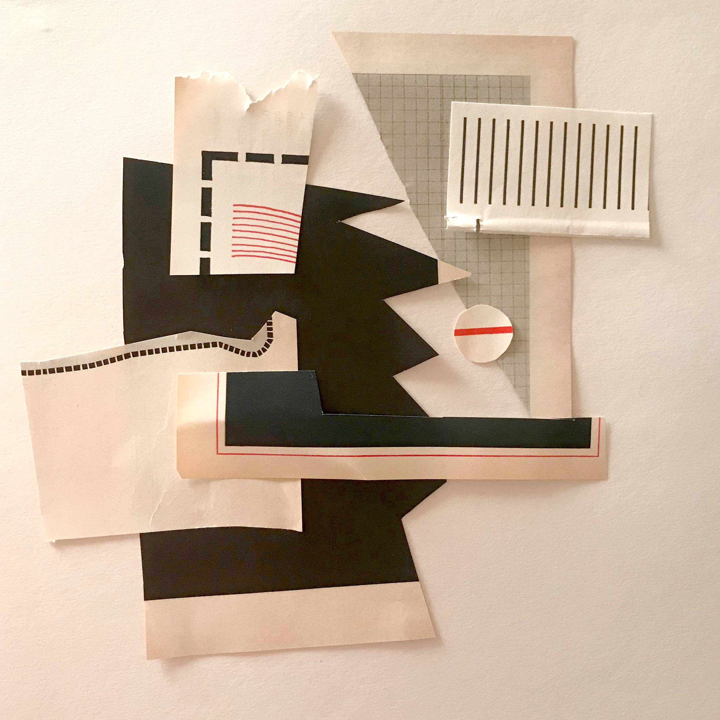
This is a poster design for a local art sale that took place in Spring. It was a collective sale featuring about 20 artists in there 20s. I was asked to design the poster with full freedom to do whatever I felt fit. My main inspiration was DADA. I felt like it was the perfect amount of eye-catching and fun while also allowing me to have fun and explore my interest in collage. I used the color red to guide your eye through the piece. You start at the sleeve, which points to the title of the event and then over to the date, down to the location, and finishing at the time. I wanted the piece to maintain it’s quirkiness while remaining balanced and effective. These posters were 10 x 13.5 and hung around town


Instagram being our second main source of advertising, I made an Instagram story sequence to use. I wanted it to match the vibe of the poster. I used elements of the poster but simplified the text to make it appropriate for mobile. Making a sequence rather than a single page helps to keep the viewer engaged and not overwhelmed with information

process//


Beginning this process, I wasn’t too sure how to approach the design, because really anything went.
I knew i wanted it to be eye-catching, and have a fun voice. I liked the pieced together aspect because multiple artists with different styles would be featured.
I laid out pieces that caught my eye and began moving them around, trying to find a way to use them in a way that would direct your eye to the most important information while still keeping the quirkiness and dada vibe. after finding my solution, i photographed it and then added text on the computer.


Gone but not forgotten ideas…
Before i decided to refine my direction I went completely for it. I knew the main audience was college aged artists so I thought about going a bit unrefined and punk, I liked it but at the same time I didn’t feel like it did the informational job it needed to. So I decided to tone it down, however the bread stayed!
